Metrics Feature Guide
Introduction
The Metrics feature helps Dispatchers, Chiefs, and General Users understand activity and trends across their division or agency.
It provides visual insights into launches, dispatchers’ activity, and the types of incidents being managed.
By default the view provides the following filter pre selected:
Date range: Last 30 days
Emergency or Drills: Emergencies only are selected.
Comparison: Metrics are shown against the previous period for context (Previous 30 days)
This guide explains how to use filters and how to interpret each chart.
At the top of the Metrics dashboard, you’ll find scorecards that highlight key performance indicators (KPIs) over the selected period. These give a quick snapshot before diving into the charts.
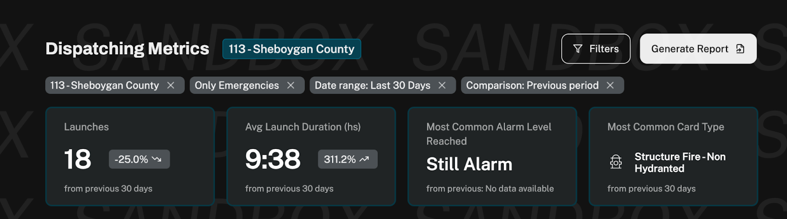
Launches
What it shows: Total number of launches in the selected time range.
Comparison: Displays % increase/decrease compared to the previous period.
Use Case: Quickly see if activity is trending up or down.
Avg Launch Duration (hs)
What it shows: The average time (hh:mm) it takes from launch start to completion.
Comparison: Shows % change vs. the previous period.
Use Case: See the average duration of your emergencies.
Most Common Alarm Level Reached
What it shows: The alarm level most frequently reached (e.g., Still Alarm, 2nd Alarm).
Comparison: Shows if there is data from the previous period; otherwise notes "No data available".
Use Case: Helps understand the severity profile of incidents.
Most Common Card Type
What it shows: The card type most often used during the selected time period (e.g., Structure Fire, Disaster, EMS).
Comparison: References the most common type from the previous 30 days.
Use Case: Track shifts in the types of emergencies or drills most frequently managed.
Filters
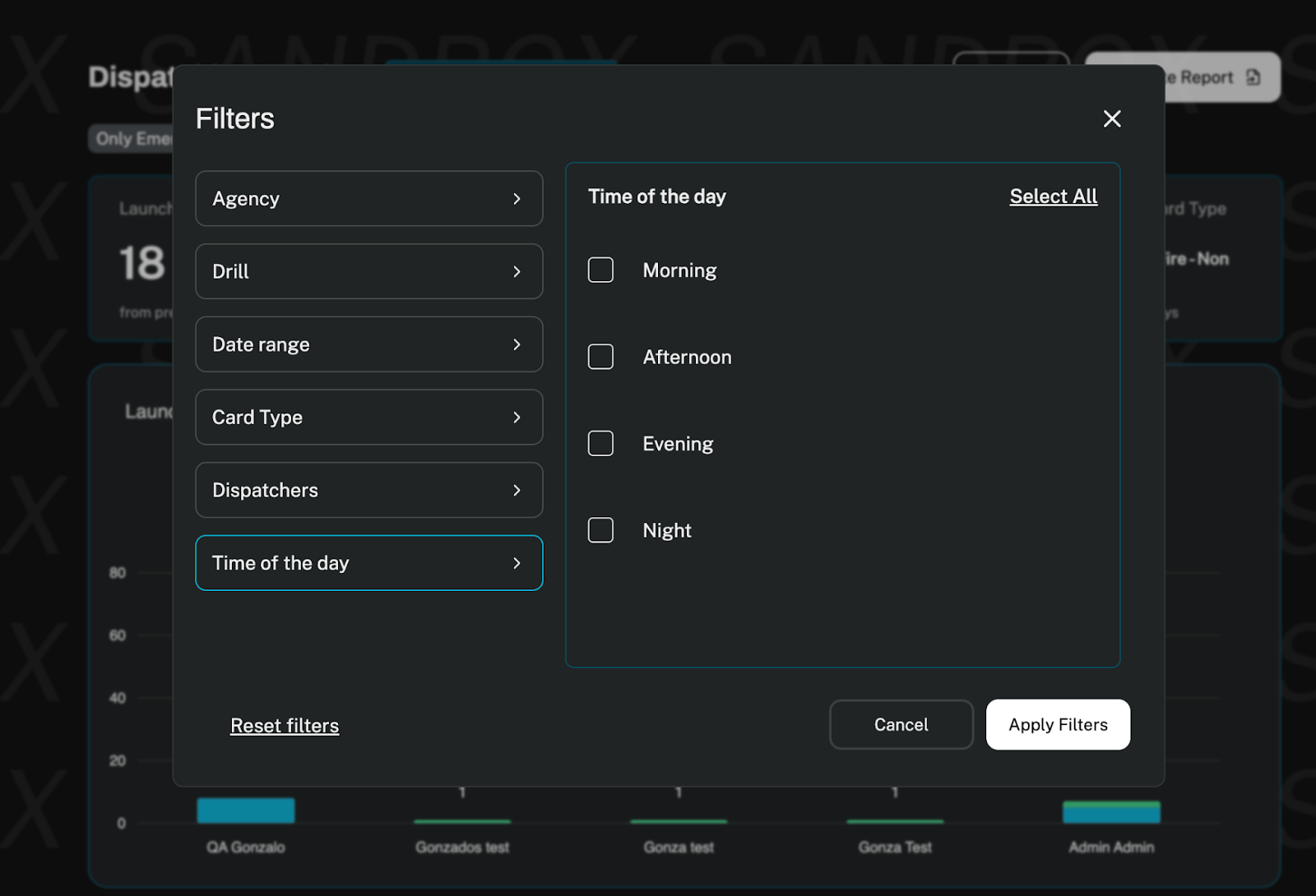
Agency:
Select one or multiple agencies to focus metrics on specific agencies.
Useful when comparing activity across multiple agencies.
Drill (Yes/No)
Choose whether to include drills or focus only on real emergencies.
This helps distinguish between training activity and live response.
Date Range
Adjust the timeframe for the analysis.
Default: Last 30 days
Comparison: Automatically compares against the previous period of time
Card Type:
Filter by type of card (e.g., Life Safety, Disaster, EMS).
This allows you to analyze activity patterns per incident type.
Dispatchers:
Focus metrics on one or more dispatchers or compare across all.
This helps track workload distribution and identify trends.
Time of the Day:
Narrow down launches based on when they occurred (morning, afternoon, evening, night).
Great for identifying peak hours of activity.
Tip: All filters are global. For example, if you select one dispatcher and limit the range to “Last 7 days,” all charts will reflect only those conditions.
Charts:
For now we offer the four following charts:
Launches per Dispatcher (Stacked Bar Chart)
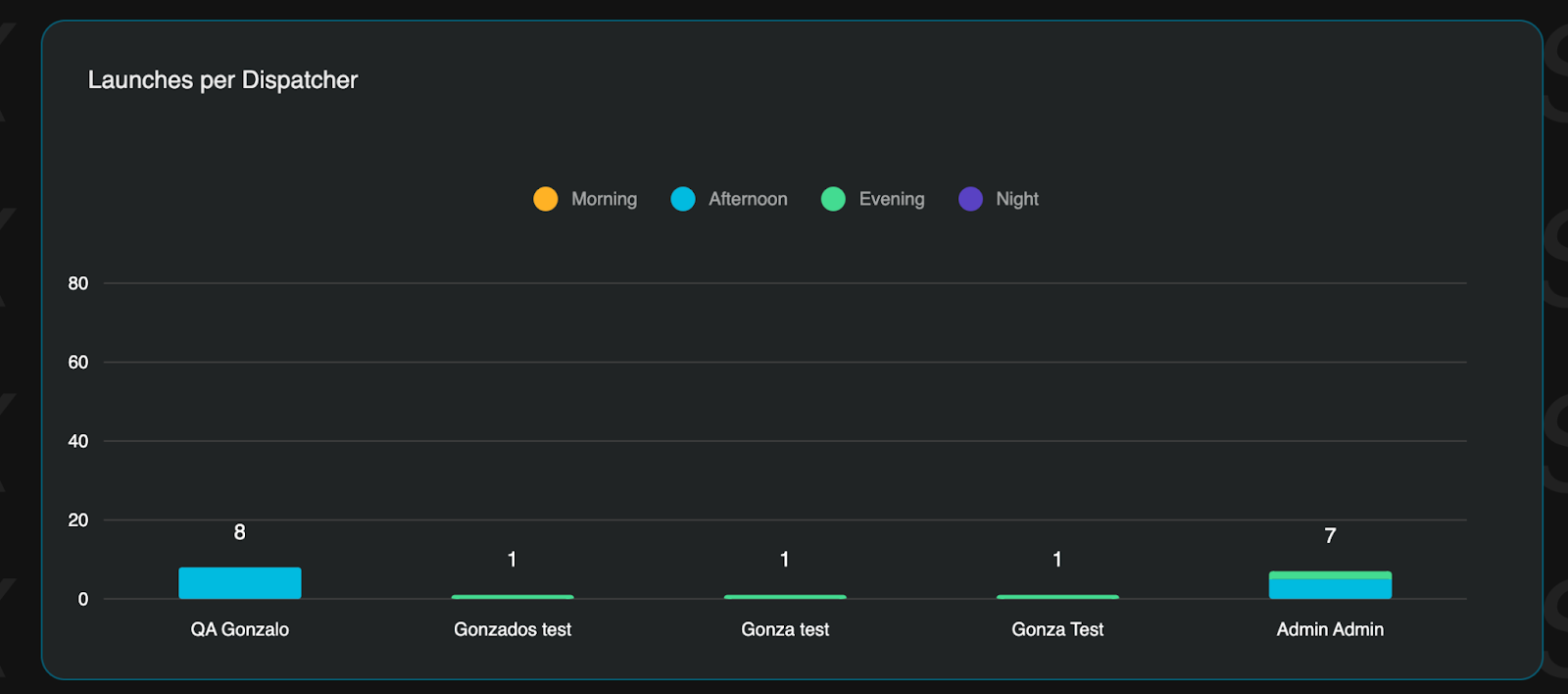
X-axis: Dispatchers
Y-axis: Number of Launches
Stacked by: Time of the Day
Purpose: Shows workload per dispatcher and when they are most active.
How to Read:Taller bars = more launches.
Colors within each bar represent launches by time of day.
Use Case: Identify imbalances in dispatcher activity and optimize shift coverage.
Launches Over Time (Line + Bar Chart)
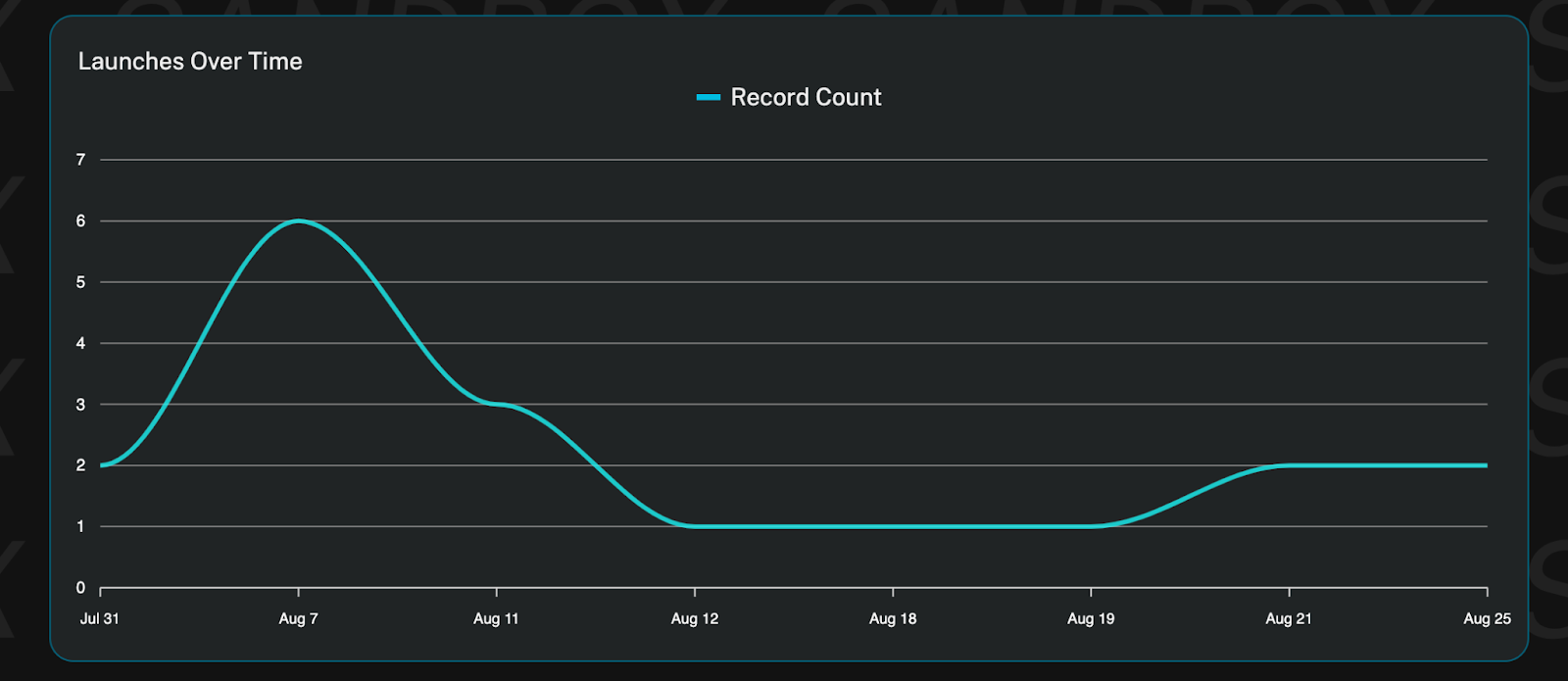
X-axis: Days
Y-axis: Launches
Purpose: Track daily activity trends.
How to Read:
Peaks = busiest days.
Use Case: Spot peak demand days, evaluate seasonality
Launch Distribution by Dispatcher (Pie Chart)
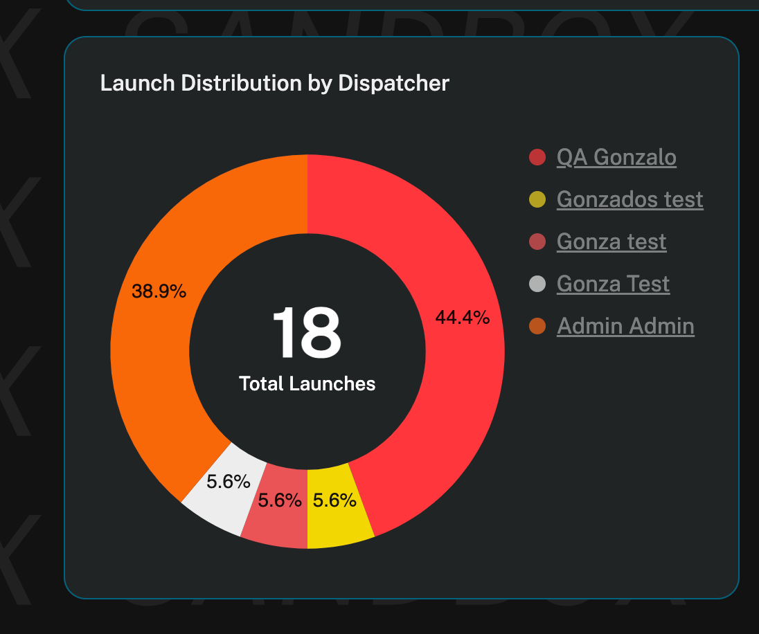
Slices: Each dispatcher
Purpose: Show the overall share of launches handled by each dispatcher.
How to Read:
Larger slices = higher proportion of launches.
Hover to see exact counts/percentages.
Use Case: Identify workload imbalances between dispatchers.
Launches per Card Type (Pie Chart)
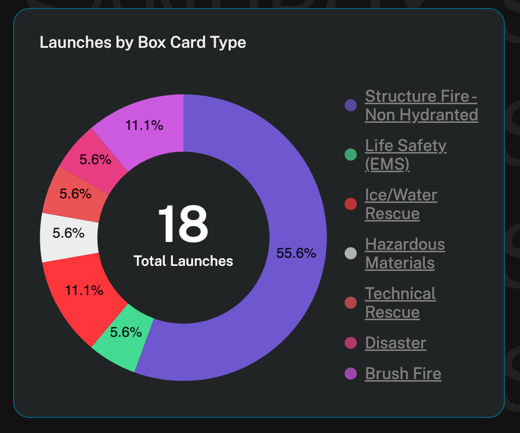
Slices: Each card type
Purpose: Show proportion of launches by incident type.
How to Read:
Each slice represents the share of a card type.
Useful to track whether most launches are EMS, Life Safety, or Disaster-related.
Use Case: Support resource allocation by understanding which incidents dominate launches.
Was this article helpful?
That’s Great!
Thank you for your feedback
Sorry! We couldn't be helpful
Thank you for your feedback
Feedback sent
We appreciate your effort and will try to fix the article